6. Widgets
Widgets are available for setting the :
headers and footers ;
title pages
There are four types of widgets
Widgets Text and Image which always reference static elements, for example, an image from a workspace, or a text entry.
Classic widgets reserved for specific elements of the XML document. They are named after these elements (Title, Date, Author, etc.).
![[Tip]](cco-tip.svg)
The Organization widget corresponds to the Docbook
affiliationelement, which is part of theauthorelement. These elements are present by default in theinformationblock when a book or article is created.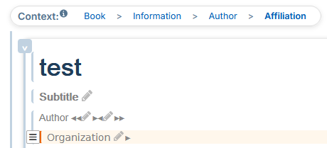
These elements can be added to the
informationblock via the menu → in the xml content editor.Widgets Custom Xpath allow to retrieve other elements from the XML document.
Widget Grid lets you group any type of widgets for adaptive placement.
Each widget can be edited directly from the settings panel. In this case, the widget can be reused as a template with predefined formatting. This type of editing is recommended for Text and Image widgets where the content can be modified for each reuse.
6.1. Editing modes
There are two editing modes for widgets:
from the parameter editor to the left of the preview area;
from the panel “Widget List” to the right of the preview area.
Editing from the Parameter Editor
Each widget can be edited directly from the parameter editor to the left of the preview area. In this case, the widget can be reused as a template with predefined formatting. This type of editing is recommended for Text and Image widgets where the content can be modified for each reuse.
Procedure 47. To set up a classic widget:
Click on
 to the right of the widget name.
A window opens with the settings.
Click on one of the colored parts of the margins and borders diagram to display its characteristics:
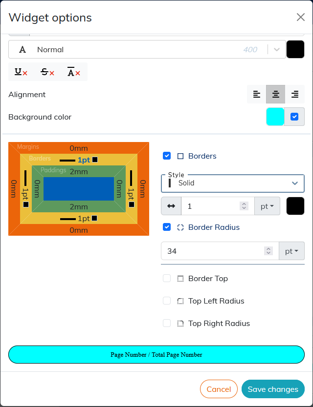
The result of the setting is displayed in the preview area at the bottom of the window.
To apply the rounded corners to the widget borders, click the border (yellow box on the diagram), select the corner or corners you want to round, and apply the desired radius value.
![[Note]](cco-note.svg) | |
The sections Custom Xpath widget and Grid widget describe the specific settings for the custom Xpath widget and the Grid widget respectively. |
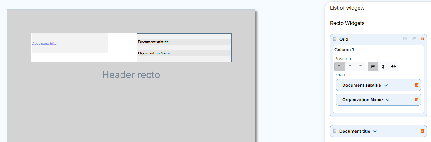
Editing from the Widget List panel
The panel “Widget List” allows you to edit the widgets dropped on the preview area (cover page or header/footer area).
Dropped widgets display their title and light gray background by default. The Grid widget displays the background and its borders.
The  button in the menu or
  button in the menu allows you to view the set widgets without their default background or borders for the Grid widget.
Each dropped widget displays a dedicated insert in the panel on the right. This insert unfolds automatically either:
when dropping a widget or;
when selecting a dropped widget.
To select a widget, click either:
on the dropped widget or;
on his insert in the panel on the right.
The selected widget and its insert are displayed with a blue border:
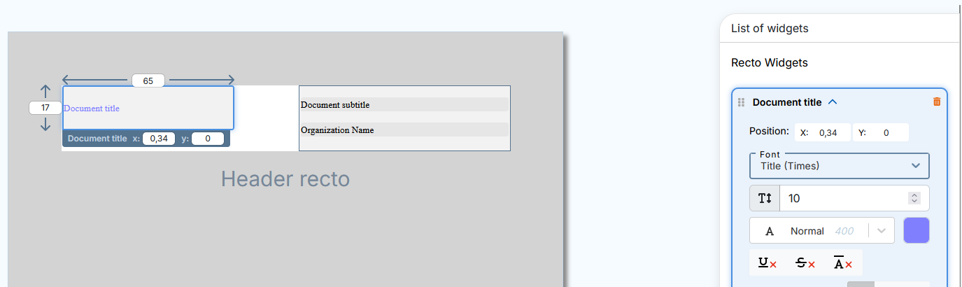
The selected widget displays the following settings available for editing in the preview area:
Height and width (except the Grid widget),
position with XY coordinates (also available in the widget insert).
The setting of styles, alignment, margins, borders etc. is done in the inset of each widget on the panel on the right.
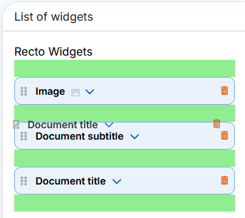
Actions that are specific or common to all widgets are available to the left and right of the widget title in the insert:
 indicates the widgets that can change the order in the list (see Procedure 48, “To move the widget”);
 click to select and insert an image in the Image widget.
 click to open or close a widget insert.
 click to delete the widget and its insert.
| |
For specific settings and actions for the Grid widget, please see Grid widget. |
It is possible to move the widgets to the panel on the right to change their order in the list.
Procedure 48. To move the widget
For more visibility, close the opened inserts.
Click in the insert, hold and drag and drop the widget into one of the green areas that appear before and after the inserts:
In the case of setting a title page, setting the order of the widgets in the list on the right allows you to organize overlapping widgets.
Example 3. Widget overlay on the title page
The Image widget was dropped first. The Title widget has been dropped second, so it hides the Image widget that should appear on top of the title.
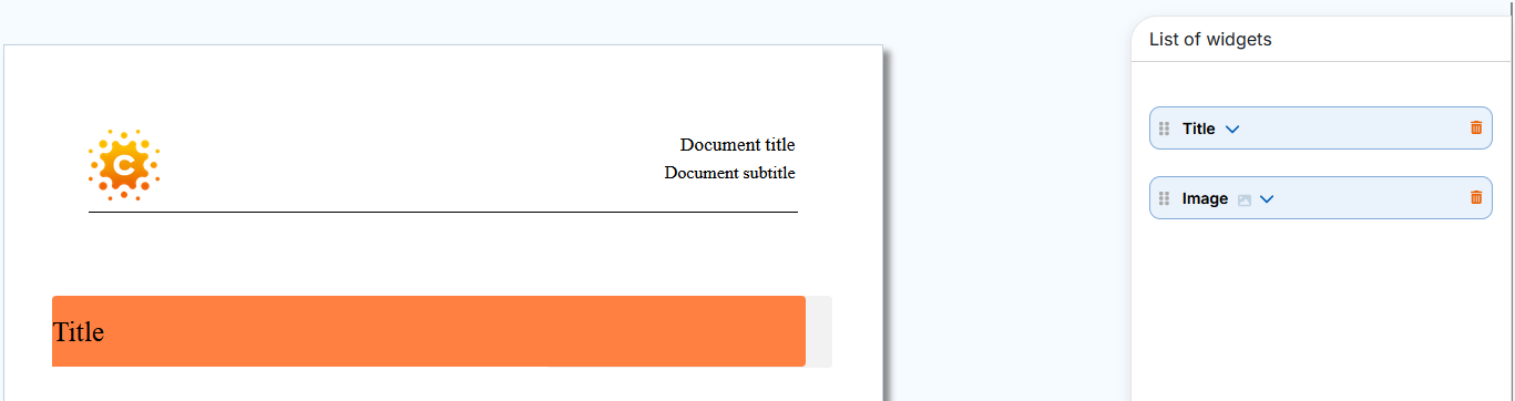
Simply move the Image widget before the Title widget in the panel on the right and the image will overlay the title.

| |
To edit an overlay widget that is not available for selection in the preview area, click its insert in the panel on the right. The widget is displayed on top of the others for better visibility of the change results. |
| |
The change in order of widgets within a grid (within the same cell, between cells and columns) is done directly in the dropped widget. The order of widgets changes automatically in the panel on the right. |
| |
For recto verso mode, the panel “Widget List” in the menu contains the widgets into two respective sections: verso widgets and recto widgets. |
6.2. Custom Xpath widget
The custom Xpath widget can be used to retrieve elements from the XML document that are not available in widgets linked to a particular element.
Xpath is a language for identifying the elements of an XML structure. The configuration of the widget consists in composing an access path for the element of the XML document. This path consists of the nodes (elements, attributes, processing instructions, etc.) linked together by path expressions.
| |
The use of path expression types is described in Table 1, “Most Common Path Expressions”. |
The Information block in the WXE editor contains information that is not published by default. The custom XPath widget allows them to be published.
Elements that can be retrieved from the style sheet via xpath, must also be placed in the Information block of the XML document:
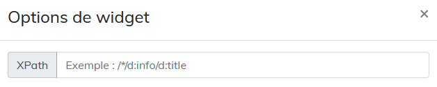
Procedure 49. To compose the xpath:
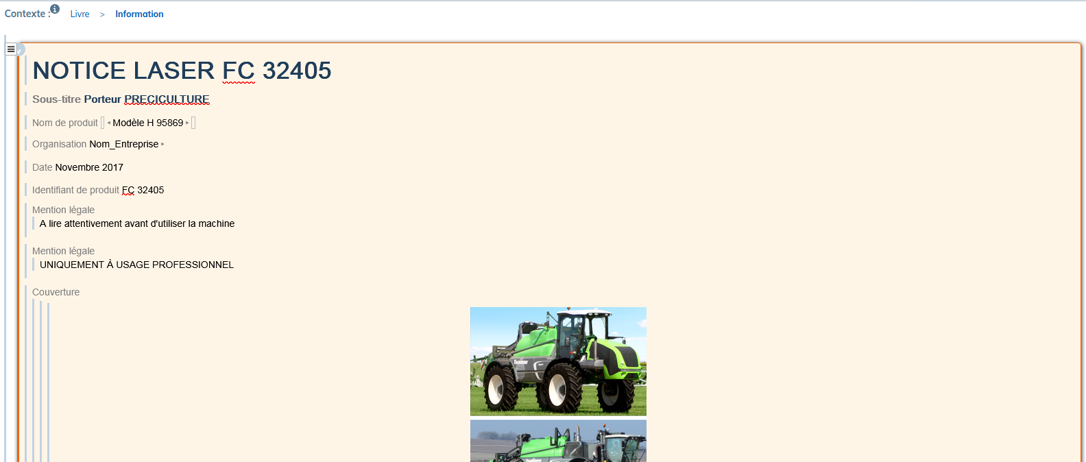
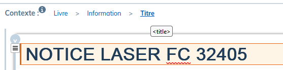
In the
Informationblock, select the desired element.In the Context, locate the name of this element.
These names are part of the naming convention according to the DocBook standard and are displayed in the tooltip when hovering over each element.
In the studio, drag the widget into the preview area.
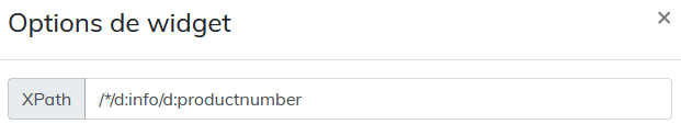
In its insert on the right panel, in the XPath field of the studio, place the nodes represented by the names of the elements. Precede each name with
d:and separate with/. Since the elements are placed in theInformationblock, the path will start withd:info/.![[Important]](cco-important.svg)
For xpath elements in the header or footer, the path must start with
/*/.This allows the style sheet to retrieve the element for all the page sequences generated by the structure elements (chapters, sections, preface, etc.) present in the document.
| |
For the element |
Setting the xpath to select particular elements of the same type
It is possible to retrieve several elements of the same type (several images, several tables, etc.) in the style sheet via xpath.
Here is the example of the image recovery procedure.
Place all the necessary images in the Information block > Cover.
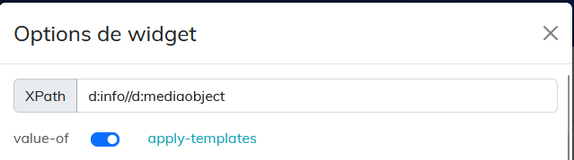
Give each image a different value in the
roleattribute by selecting theimageobjectelement.Compose the xpath for each image as follows in the example: d:info//d:imageobject[@role='image_produit'].
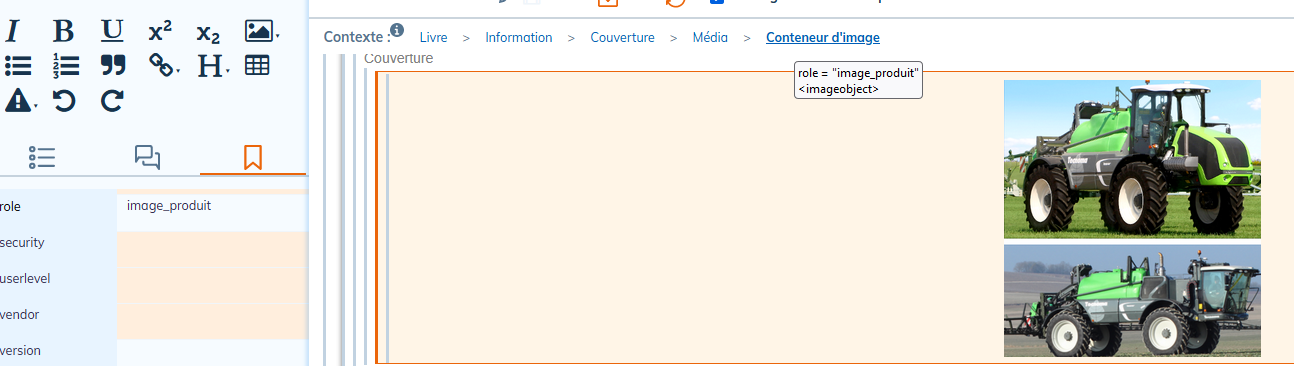
Table 1. Most Common Path Expressions
|
Syntax |
Use |
Example |
|---|---|---|
|
|
indicates that the element belongs to the DocBook namespace. |
d:info/d:date |
|
|
used to select children of an element. It indicates that we want to select an element that is directly under the parent element. |
d:info/d:date For the example given, the |
// |
used to search items in depth. |
d:info//d:date For the given example, we will search for all the |
|
|
selects all items. |
d:info/d:legalnotice/d:* |
|
|
used to filter selected items based on their attributes or values. Or to represent an index in a list. |
d:info/d:legalnotice[2] For the given example, the xpath selects the second |
|
|
selects attributes. |
d:info/d:date[@role='anniversaire'] For the given example, we select the |
6.3. Grid widget
The Grid widget allows widgets to be organized into rows and columns for more accurate positioning in relation to each other.
The Grid widget is available in the and menus.
The grid can be edited:
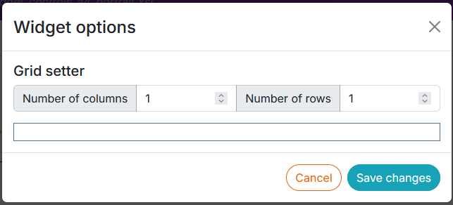
from the parameter editor to define a template with a default number of columns and rows:
from the Widget List panel.
The grid has 2 operating modes:
Dragging To activate dragging mode, click on the icon:

Column editing. To activate column editing, click on the icon:
Drag - drop the widget Grid in the preview area.
Click on
to add rows and columns and set the width of the columns: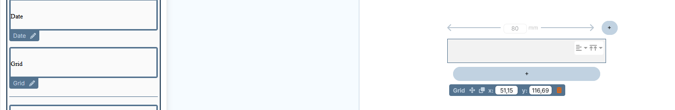
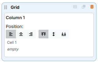
Drag and drop the necessary widgets inside the cells, on the green background that appears the moment the widget hovers over the cell's borders. The inserts for these widgets are automatically added to the inside of the grid insert.
If the widgets are to be very close to each other in the vertical direction, it is recommended that they be placed in the same cell.
The change in order of widgets within a grid (within the same cell, between cells and columns) is done directly in the dropped widget. The order of widgets changes automatically in the panel on the right.
It is possible to drag and drop widgets from one grid to another.
![[Caution]](cco-caution.svg)
The image embedded inside the grid via the widget or the custom Xpath, takes the width of the column. It must not have any dimensional or alignment settings in the XML editor (WXE).
When the grid is located in the header or footer area (and not on a title page), column widths can be defined either in millimeters or proportionally. To switch between them, use the button:  or
or  located on the dropped widget and in edit mode.
| |
Using a proportional unit grid is useful for PDF documents with alternative page formats, such as certain landscape pages in a portrait document. This is because the proportional grid will adapt to the zone in which it is located. |
When the grid uses proportional column widths, it occupies all the space in the zone.
Explanation of proportional column widths :
The total width of a grid is the sum of its column widths.
The width of one of its columns is therefore the ratio of the width of that column divided by the sum of the column widths multiplied by the width of the zone.
Example 4. Proportional grid
A grid in a 185 mm wide header.
Grid units are proportional.
The grid has 3 columns.
The following column widths: 1, 2, 3
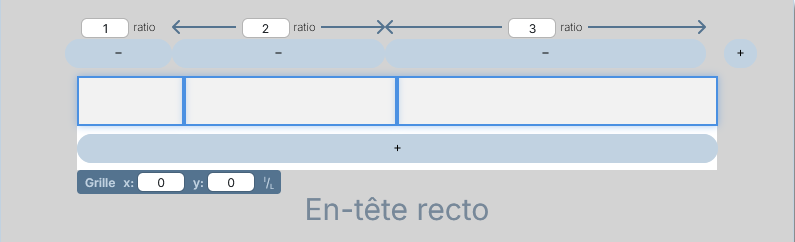
The first column: 1 / ( 1 + 2 + 3 ) x 185 = 30.8mm
The second column: 2 / ( 1 + 2 + 3 ) x 185 = 61.7mm
The third column: 3 / ( 1 + 2 + 3 ) x 185 = 92.5mm
| |
It is possible to duplicate a widget grid with its widgets and their settings. |
